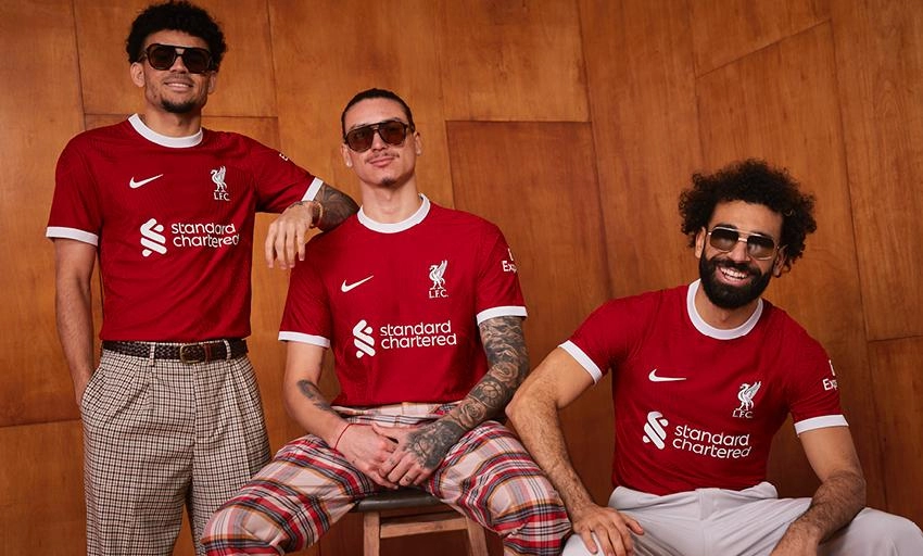
Liverpool logo on a fruit of the loom T-Shirt, modelled by gormless golf trouser-wearers. Nice.


Liverpool logo on a fruit of the loom T-Shirt, modelled by gormless golf trouser-wearers. Nice.

Not even close to being the worst photo either.
Toggle Spoiler

Someone tell the fat cunt he doesn't play for us pls.


If only. Makes Fabinho look downs.
I'm a twit

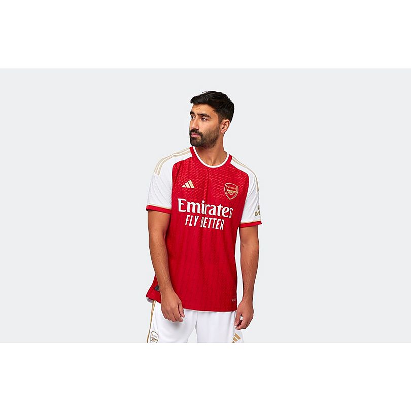
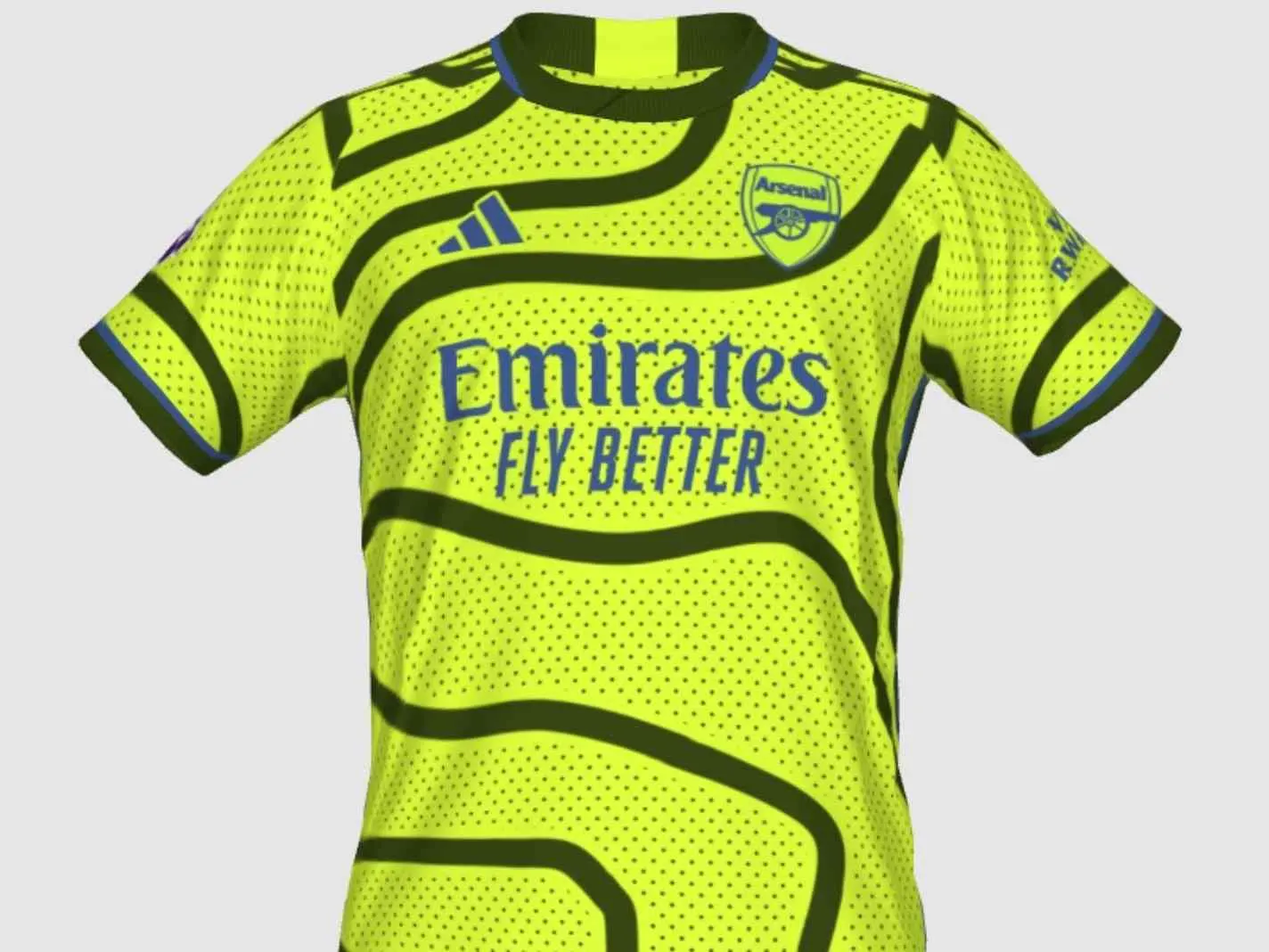
The Arsenal home looks nice and the rumoured Arsenal away looks so bad I have to hope its a joke.
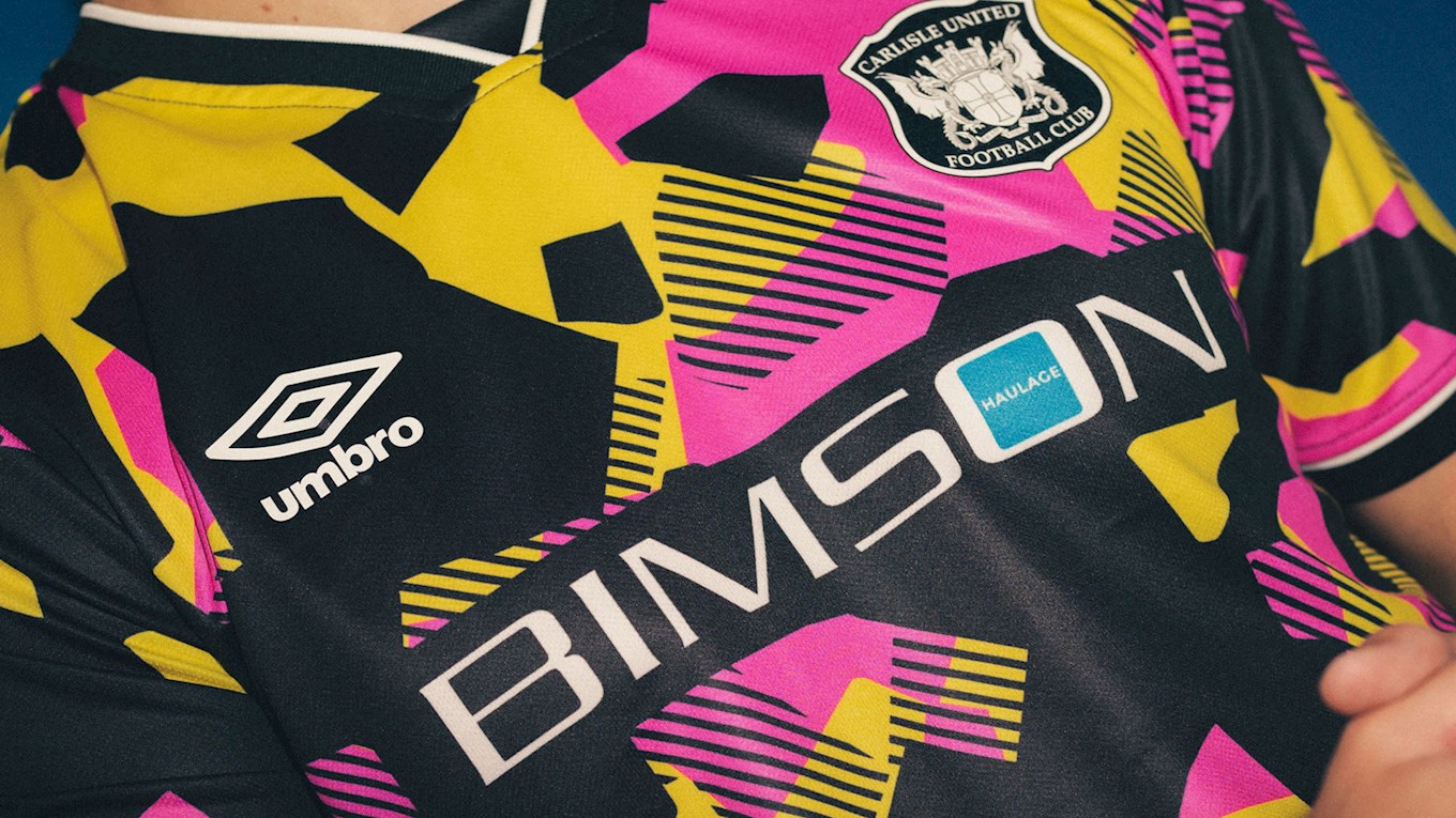
Apologies for image size disparity. Two cracking away kits here. Carlisle home is also nice.
Stupid tiny picture, but only one I could get to work.

Last edited by mo; 01-07-2023 at 07:11 AM.
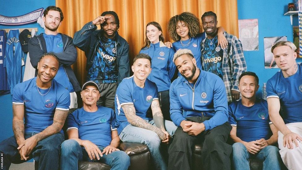
I see the chuckle brothers are out kit modelling again.
Toggle Spoiler
Looks rubbish, and the blurb that comes with it is just as bad.
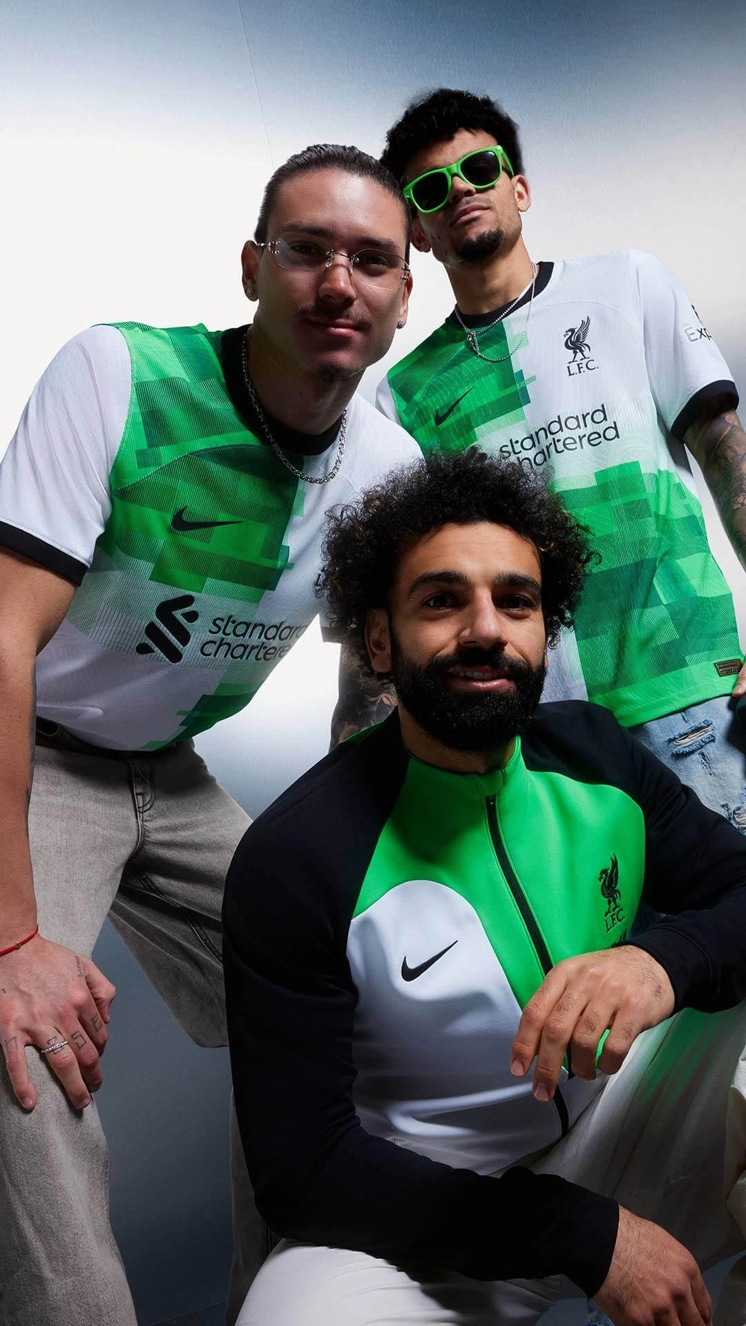
The original season was a belter though. Cantona's comeback game up there as one of the best. Don't make 'em like Robbie Fowler [or Cantona for that matter] anymore.The jersey features the green and white quarter pattern with black collar and cuff, updated with a digital effect treatment layering tonal greens green spark, poison green and pine green for a modern twist.
Yup, fucking ugly, as per last season's away shirt. Nike are doing well to fuck this up every season.
Would love a plain white one. Basically a Spurs kit (or the England women’s kit) with the Liverpool badge (preferably not just a liverbird) on.
I'm a twit

I mostly like the shirt. The thing I don't like about their designs is that curve that goes from around the armpit up under the collar and back down again.
However again it irks me as it's Nike doing a 'throwback' kit to one that was made by Adidas.
Same. Last years home kit would have been okay without that.Originally Posted by Gray Fox

I'm a twit

All that picture needs is DJ Spoony and Graham Rix to complete the perfect bullshit marketing aesthetic.
Their whole campaign is about the 90s and it’s the least 90 s looking shirt ever. Probably designed by a tranny born in 2004.
I'm a twit
I'm a twit
Umbro are producing some sexual kits

The Arsenal kit is so bad I almost want us to flame out so they bin it. It's Chelsea as fuck.

Yet somehow still better than the United one.
I googled this when you first posted it and just saw the home kit, which I thought was fine so wasn't understanding your seethe. However, I've just seen a picture of Havertz from last night and now realise you must have been talking about the away kit. Fucking hell it's one of the worst of all time.

They're showing Nike how proper 90s nonsense is done


Superb
link
Didn't they do the same last year where they had home kit in blue and away kit in slightly darker blue?

That is a thing of beauty.

Someone link an Asian knockoff ASAP.
There seems to be a few shirts this year where the promo shots have been edited so much that the real thing looks way different. Some Liverpool hoodies had the same issue.
The Man Utd away shirt suffers from it, too. Described in the media as dark green and off white, the actual shirt looks way more like black and white.
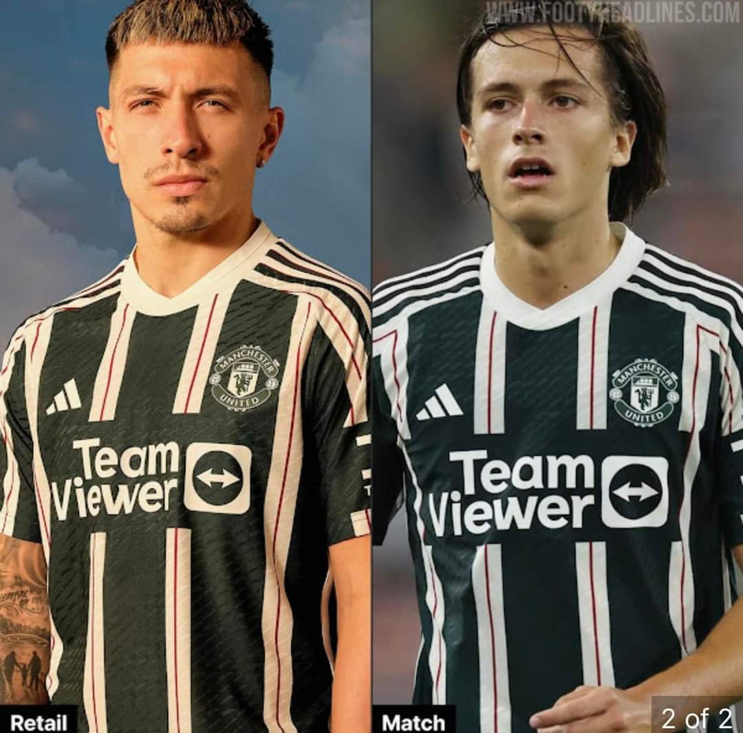
It's just studio lighting vs daylight, no?
United's shirts have been blighted by their sponsors for years now.

The left shot is clearly a well-lit studio shot vs. some random youth in an actual match. There are two versions of the kit though, one is the "pitch ready" or some other euphemistic bollocks which is like £120
It's white and gold.

Christ.
All I see is a floating sponsor and club badge.
That kind of nonsense isn't allowed in the Championship. Flamingo Land arm sponsor though, in you come sir

Did Flamingo Land design it?

Head in the sand stuff.
Nah, you're thinking of ostriches.
The new Man Utd third kit is unfortunately pretty nice.
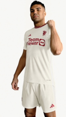
Does it have stripes down the sleeves?
I always think it's odd [and loads of teams do this] when a 3rd kit [that one looks all white] is substantially similar to the away kit [assuming that's what the dark green/black and white kit of theirs is]. I suppose if the other one has dark shorts it isn't too similar.
I prefer it when, for example, Liverpool run a red kit, white kit, yellow kit set-up. All obviously different.
In other alternate kit news Brighton's black and green one might be worse than their all green effort from a season ago.
I don't think is has stripes:
Toggle Spoiler
I'm a twit
Looks like a Liverpool kit.
Announcing them as a sponsor was the exact moment I really felt like the short-lived Premier League era was over.
I assume we had it designed before we took them on as a sponsor but they must be loving it. It does very much appear like it's a Flamingo Land specific shirt doesn't it.
Leeds is doing some sort of wanky "Year of Culture" thing at the moment (they basically lost out on being the official city of culture and made their own up) and the colour scheme for that is similar. So I think it could be linked to that somehow.
The best effort I've seen this year is from Roma.
You can't fuck up a Roma kit. Possibly the best colour scheme in the game, though I'm fond of Venezia too.
Probably why they like it.
It's fucking garbage.

That Leeds kit is banging.
I'm not as keen on this year's Venezia effort
100.
They really have donned the market for some nothing club to be such an authority on nice kit designs. I got 2 last week to bring my collection to:
I have to fucking beat the men and women away with my massive floppy.
Last edited by Don; 09-08-2023 at 08:46 PM.
Anyone else seeing three identical photos of bad plastering?
I'm a twit
Yeah, it's my trademark.
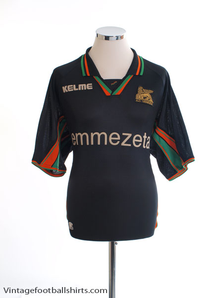
I must have posted this before but I had this one in my mid teens, an absolute beauty:
Toggle Spoiler
Where is the most legit place to grab vintage kits?

 Reply With Quote