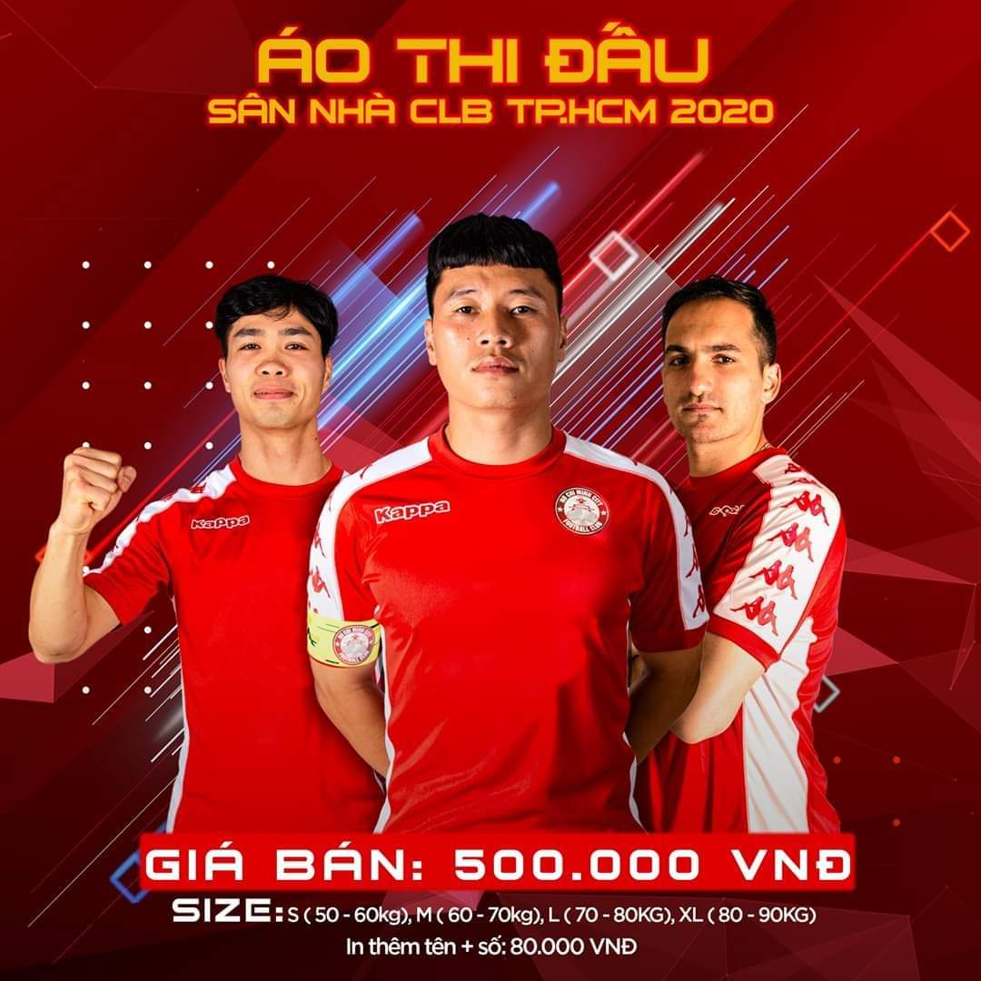
Guy on the left looks like Foe after a successful hair transplant.


Guy on the left looks like Foe after a successful hair transplant.


Perfect shirt tbh


It’s most likely going to have the Dublin City University sponsor on it by the time next season comes along though unfortunately.


Yo

Last edited by SincereTheRebel; 31-10-2019 at 08:50 AM.


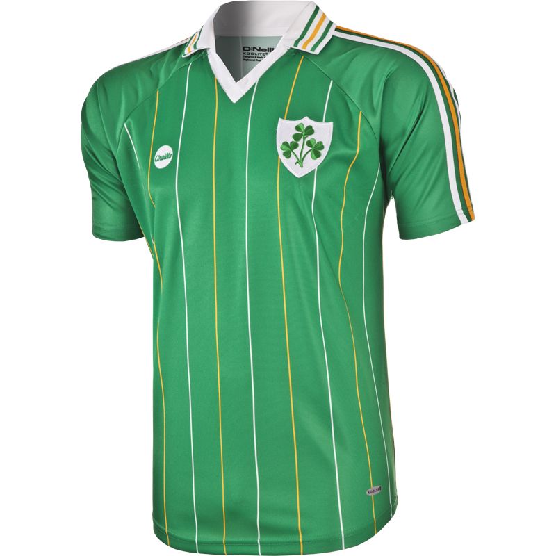
Just seen this on the O'Neills website. We need to ditch New Balance immediately and go back to this


In a coincidence, I never knew they were releasing a new kit today (maybe that’s why O’Neills had the open above on their front page). Better, but still shite. Still need the one above.


Looks like a bad photoshop.


Not sure about Dundalks but Bohs is class.
Banana stickers for a sponsor.
I'm a twit


Fyffes are ran out of here and have a big spot up in Dundalk.
Hummel came out with a third kit for us, cannily being snapped up by two-tone fans who couldn't give a shit about football

Looks like the kit the F1 drivers wear in their annual charity football match.
Is that a deliberate tribute to The Specials?
Pretty much, it's 2-Tone as a whole but people from the Specials were part of the reveal. They had to get the EFL involved to allow the dancer mascot logo to be worn

I didn't even spot that. As a childhood ska fan, I actually like it.


They need to play One Step Beyond for every goal.
Inb4 bruh asks what reel big fish has to do with cov city


Thats brutal.


Hideous.


The last England shirt that looked good was the 1990 one.
Those stripes on the side are going to add a lot of speed.


Nice.
You'd have to be a full kit wanker to get any worth out of that seeing as it's the shorts/socks that really make it.
Anniversary kits though. No thanks. Fuck the heritage rounds or whatever they call them in the NFL. Let's not be having any of that.


For some stupid reason our new kit is only being sold without the sponsor logo or numbers. Therefore, it's boring and shit.


small letters


Brilliant.
I don't know what I'm looking at but it sounds funny.
I'm a twit


And for the second year in a row Bohemians bring out an away jersey the most likely wont be allowed to use.


That logo looks a bit 'school crossing'.


I think they are meant to be crossing a border perhaps that's what they were going for tbh.


the new MLS font is


Hard to do red and black badly though.


the Cowardly Black and Tans


This is another one of those situations where I don't know if Bruh's after some context.


I just enjoyed reading the sentence tbf.
The capital c in Cowardly is what makes it. It's very 'The Assassination of Jesse James By The Coward Robert Ford'.


That's literally what popped into my mind as well lol


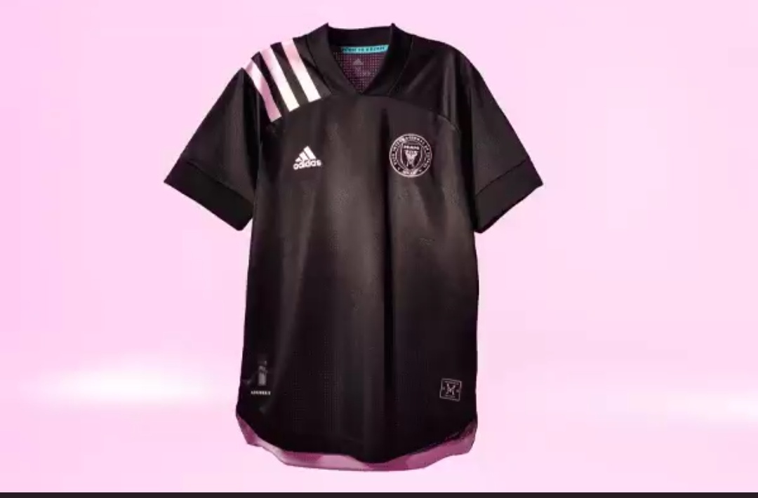
The MLS kits are fucking shit this year. Miami selling the shirts without a sponsor is a joke, too.

Last edited by John Arne; 22-02-2020 at 04:59 AM.


That looks very 90's DC United.


A USA 94 kit.
Apparent Liverpool Nike leak.


